|
For this assignment we were asked to to first draw 15 logos and come up with 15 words. We were told to choose our favorite 3 and vectorize them. We were than told to create 3 different variations of the 3 vectorized logos. Something that was frustrating was that I missed a class which made me a bit behind and I forgot to save my work. My favorite part of this project was the vectorizing part because it was interesting and easy. I learned how to vectorize things during this assignment. 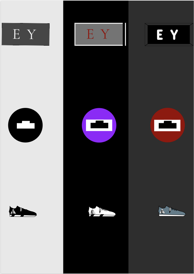 The name of the brand is EY. My brand is a sneaker store. The logo represents the store because it's a store. This logo is my favorite because it's unique and represents the brand the best. The most important part of the process for me was thinking of ideas. 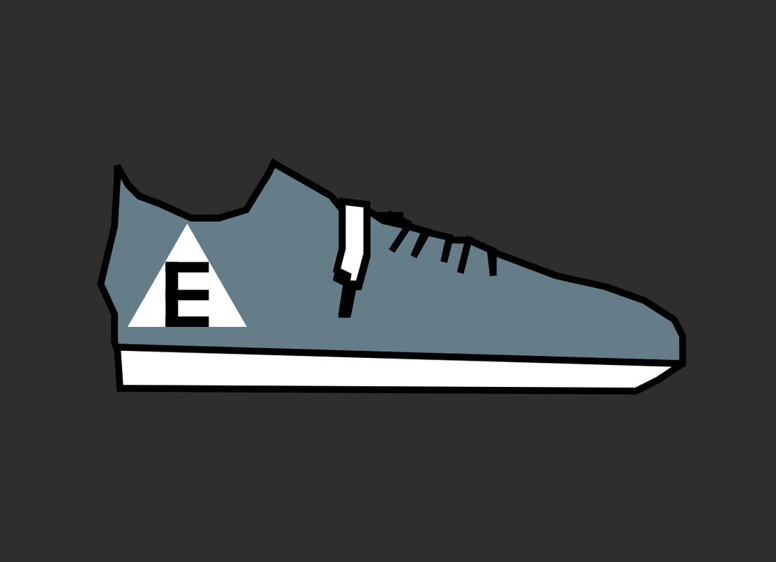 2 of the 3 logos I chose represent me because it's simple and I like simple easy to do things. My other logo I chose represented something i like wearing on my feet shoes. The process was kind of hard at the start because I couldn't think of word but as more time passed it became easier. the hardest logo was the shoe one because it was the last one i did and i couldn't think of what to do. My favorite one is the shoe because it took a long time and my favorite is the one with just the E because its too boring. The process wasn't boring but it wasn't very fun either. 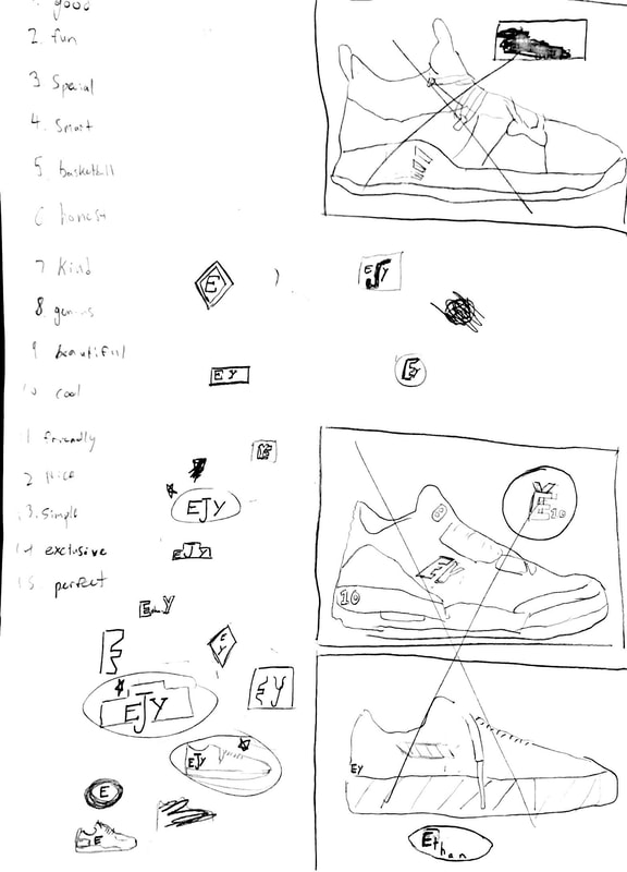 For this assignment we were told to use adobe color wheel to create different color palettes with each palette having 5 colors. 1 should be monochromatic, another, analogous, another complementary and the last one should be triadic. Monochromatic color wheels have 1 hue and various brightness/saturation levels. Analogous color wheels have hues next to each other on the color wheel. Complementary color wheels combine hues form the opposite side of the color wheel. A Triadic color wheel combines 3 evenly spaced hues from around the color wheel. My favorite color scheme were the Complementary and Triad because i didn't like the other colors I chose for the monochromatic and the brightness of the analogous shapes. The Complementary and Triad colors also made more sense together. The hard part was copy and pasting all of the hex codes because it was time consuming, 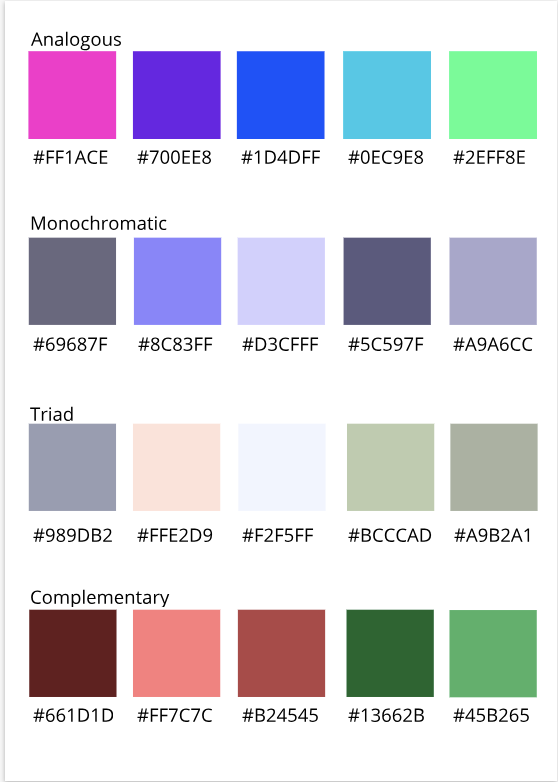 For the color names summative assignment we were asked to create something and make at least 15 with each of the items having a different color. We were than asked to label the colors using RGB values and Hex codes. Some challenges I faced at first was choosing what item to make. Some of the success I had was with coloring the objects in and copying down the Hex and RGB because I was able to do them fast and efficiently. Im proud of the design because I use computers a lot at home and thought my design was interesting. Some tools i used in Gravit were the pen tools. I used the pen tool to create the windows logo in my design. The concept/inspiration for this design was my computer. (link) 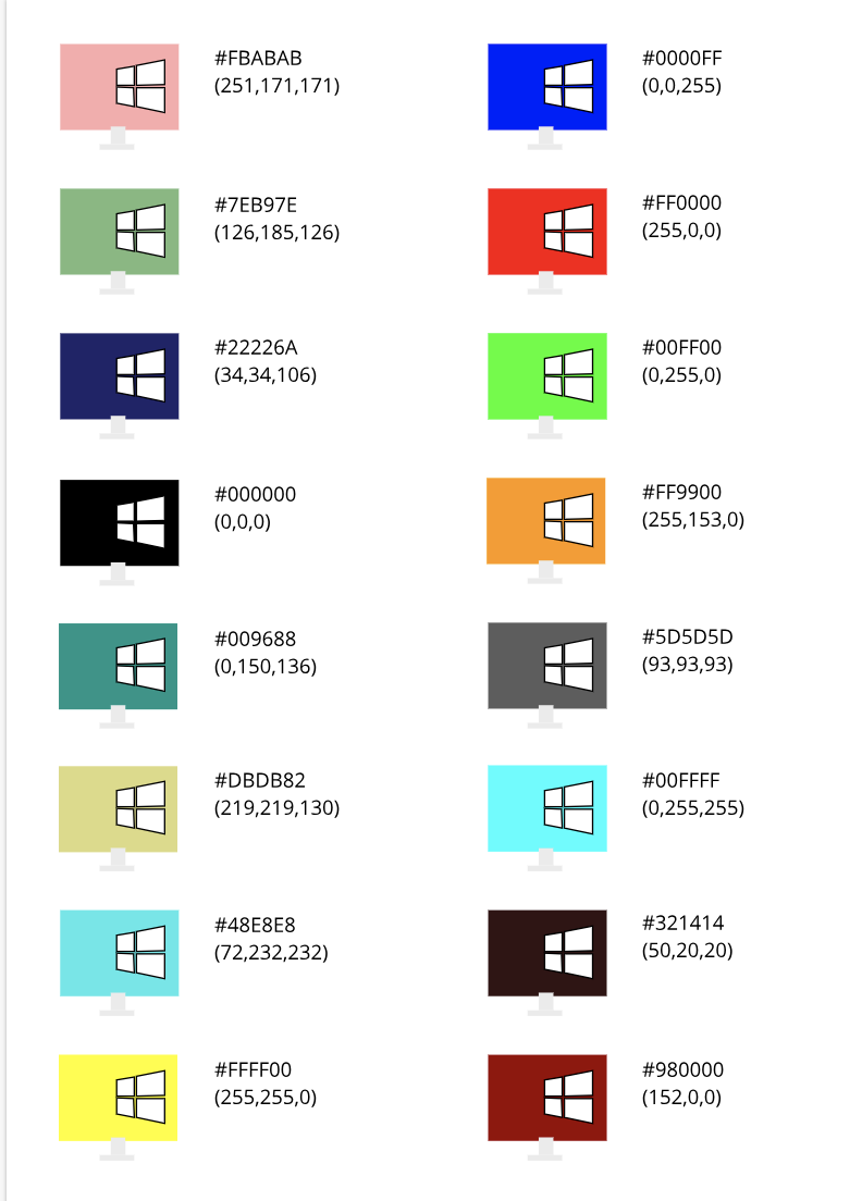 Typography is the style and appearance of a printed matter. Typography is important because it can change the entire look and feel of things. Typography can change how people view the document. The quote "Each font has a personality and a purpose". Means all fonts are unique and can be used for different things for example fun fonts should not be used for serious things like on a graves stone. 5 different fonts Serif : Have feet : font utilized in print and large blocks of text Sans Serif : Do not have feet : font utilized on the web, headlines, titles and small chunks of text Monospaced : each letter takes the same amount of space and does not work work well with large texts : utilized in coding Script/handwritten : cursive, calligraphic and handwritten and difficult to read : utilized in logos, large headlines and details Novelty : good attention getter and popularity comes and goes : utilized when used sparingly and in titles Typeface ComparisonFor the typeface comparison we were asked to choose a word than write what type of font it is and than write the font type. 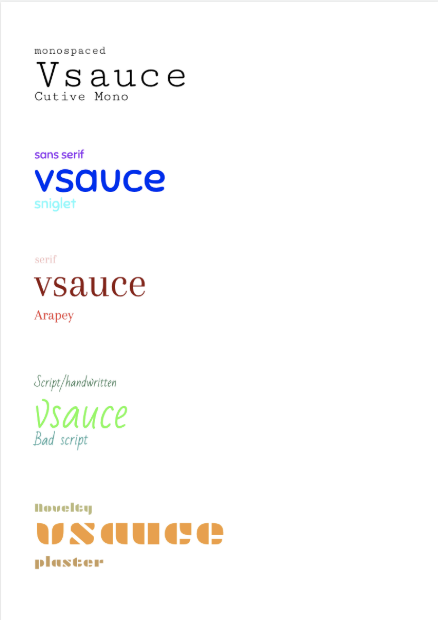 Word PortraitsFor the word portrait assignment we had to choose fonts and write a word that it reminded us of and a word it didn't remind us of in that font. 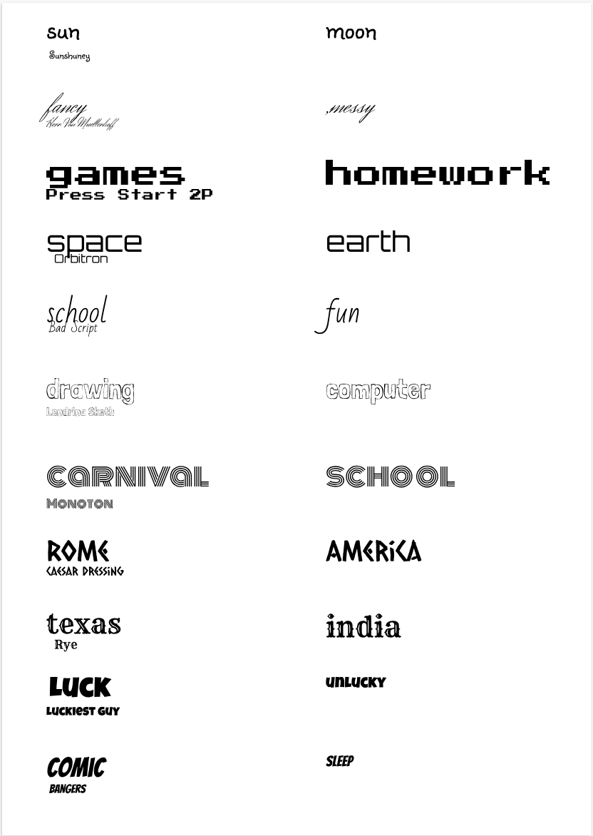 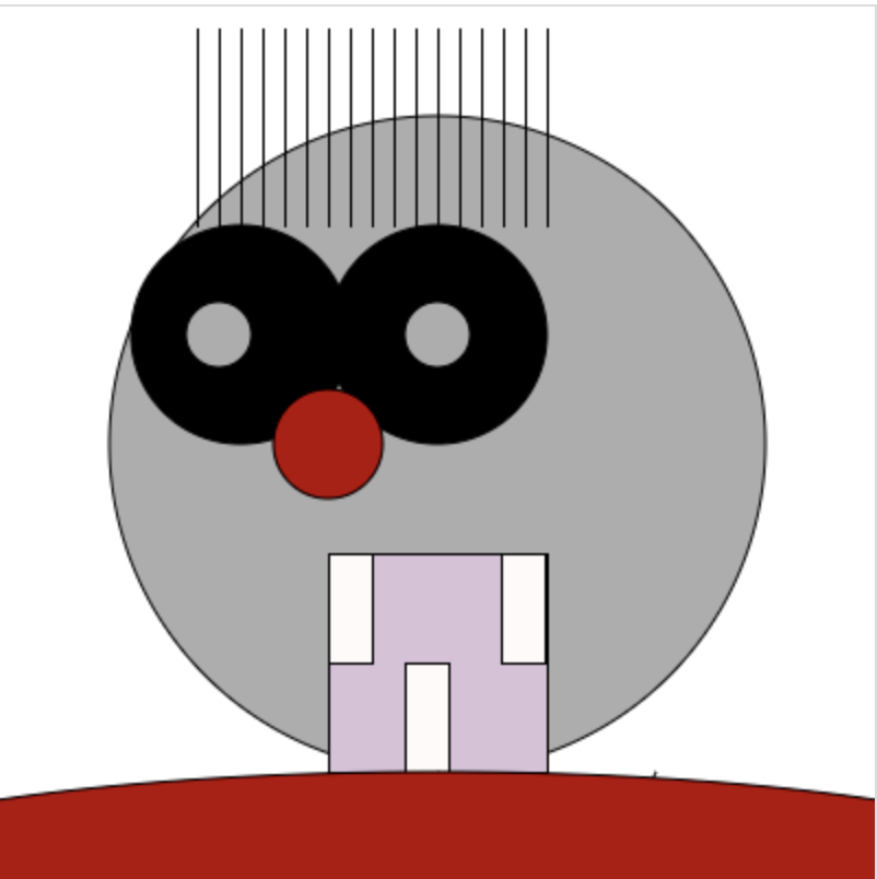 I learned how to make artwork with code. I learned how to make circles, lines and squares. I made the artwork by combining multiple shapes such as circles and squares. Some challenges i faced was i forgot to label the lines of code so it got very confusing.
Lines of code (255, 255, 255); fill(173, 173, 173); ellipse(200, 200, 300, 300); fill(0, 0, 0); ellipse(110,150,100,100); ellipse(200,150,100,100); fill(217, 193, 217); rect(150,250,100,100); fill(255, 250, 250); rect(229,250,20,50); rect(150,250,20,50); rect(185,300,20,50); fill(173, 173, 173); ellipse(100,150,10,10); ellipse(200,150,10,10); fill(181, 0, 0); ellipse(150,200,50,50); line(1,1000,300,350); line(500,1000,150,350); line(500,1000,200,350); ellipse(200,400,600,100); line(100,100,100,10); line(90,100,90,10); line(110,100,110,10); line(120,100,120,10); line(130,100,130,10); line(140,100,140,10); line(150,100,150,10); line(160,100,160,10); line(170,100,170,10); line(180,100,180,10); line(190,100,190,10); line(200,100,200,10); line(200,100,200,10); line(210,100,210,10); line(220,100,220,10); line(230,100,230,10); line(240,100,240,10); line(250,100,250,10); |
AuthorMy name is Ethan Archives
May 2019
Categories This work is licensed under a Creative Commons Attribution-NonCommercial-ShareAlike 4.0 International License. |
 RSS Feed
